Guides
Retool Show on Mobile: How to Handle Components by Default
If you've ever tried to build a mobile version of a Retool app, you already know the pain: you have to select each component individually, scroll down to the show on mobile toggle, flip it on, and repeat — dozens of times. There is no way to make show on mobile true by default for all Retool components, and as of now, Retool doesn't offer a bulk-toggle option in the standard web builder. This guide covers every practical workaround available, explains why the intersection error appears, and tells you when it's time to migrate to Retool Mobile.
Why Retool Doesn't Show Components on Mobile by Default
Retool's web app builder treats the desktop canvas and the mobile canvas as two separate layout contexts. When you drop a component onto the desktop canvas, Retool does not automatically include it in the mobile layout. The assumption is that your mobile view is intentionally curated — fewer components, different arrangement. That's a reasonable design philosophy for complex apps, but it becomes a serious time sink when you simply want a 1:1 mobile mirror of your desktop app.
The community has been asking for a default show on mobile: true setting or a multi-select bulk toggle since at least 2021. Retool's response has been to invest in Retool Mobile, a separate product for building native iOS and Android apps, rather than patching the web builder's mobile canvas ergonomics.
The "Component Intersects" Error Explained
When you try to enable show on mobile on a component, you may hit an error that says the component intersects with another component. This happens because the mobile canvas has a different grid than the desktop canvas. Two components that sit side-by-side on desktop may overlap when the canvas is collapsed to a single-column mobile layout.
The frustrating part: this error can fire even for components that are mutually exclusive at runtime — for example, two containers controlled by a {{currentUser.role}} condition that can never be visible at the same time. Retool validates layout geometry statically, not dynamically, so it doesn't know they'll never overlap in practice. The only fix is to manually rearrange those components on the mobile canvas so they occupy separate grid rows.
Current Workarounds for Toggling Show on Mobile Faster
There's no magic button, but these approaches will cut your time significantly:
- Multi-select then batch-edit: Hold
Shiftand click multiple components on the canvas. In some Retool versions, the right-hand property panel will show shared properties — includingshow on mobile— that you can toggle once for all selected components. This behavior varies by Retool version, so test it on yours first. - Build mobile-first: If you know you need a mobile layout, start a new app and enable
show on mobileon each component as you place it. Retrofitting an existing large app is always harder than building with mobile in mind from the start. - Use container components strategically: Group related components inside a
Container. Enablingshow on mobileon the container makes the whole group visible, reducing the number of individual toggles you need. - Duplicate a mobile-ready app: Once you have one app configured correctly for mobile, use Retool's Duplicate App feature as a template. You'll still need to rewire queries, but the component visibility settings travel with the duplicate.
- Resolve intersections by stacking vertically: On the mobile canvas, drag components so they stack in a single column. Retool's mobile grid is narrow — treat it like a 4-column grid and make sure no two components share the same rows.
When to Switch to Retool Mobile Instead
If your use case is genuinely mobile-first — field technicians, warehouse workers, sales reps on the go — stop fighting the web builder's mobile canvas and request access to Retool Mobile. It's a purpose-built product for native iOS and Android apps with a layout system designed for small screens from the ground up.
Retool Mobile offers:
- A canvas that defaults to mobile dimensions, so there's no
show on mobiletoggle problem at all - Native mobile components like swipeable lists, bottom sheets, and camera access
- The same
queryand data source connections you already use in your web apps - Offline support and push notifications (depending on plan)
To get access, email liza@retool.com or reach out to your Retool account representative. As of the time of writing, Retool Mobile has moved out of closed beta for most business and enterprise customers.
Step-by-Step: Enabling Show on Mobile for Multiple Components
Until Retool ships a true bulk-toggle, here's the fastest repeatable process:
- Step 1: Switch to the mobile canvas view using the device toggle at the top of the editor.
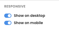
- Step 2: Click the first component you want to enable. In the right panel, scroll to the
show on mobiletoggle and enable it. - Step 3: If you hit an intersection error, switch to the mobile layout, drag the conflicting component down to a free row, then re-enable the toggle.
- Step 4: Try
Shift-clicking a group of components and check whether the shared property panel appears. If it does, toggle once to update all selected components. - Step 5: Use
Containercomponents to group UI sections. Enable mobile visibility at the container level to cut your toggle count dramatically.
Bottom Line
The lack of a default show on mobile: true setting in Retool's web builder is a real friction point that the community has flagged repeatedly. Until Retool adds bulk-toggle support, your best options are strategic use of containers, multi-select editing, and building mobile layouts from scratch rather than retrofitting. For any serious mobile use case, Retool Mobile is the right tool — request access and skip the web canvas workarounds entirely.
Ready to build?
We scope, design, and ship your Retool app — fast.