Tutorials
Retool Collapsible Container: Native Component & DIY Setup
If you've been searching for how to build a Retool collapsible container — a panel with a header that expands and collapses to hide or reveal content — you're in the right place. Whether you're trying to collapse a filter section, hide dense detail views, or just save screen real estate, Retool has you covered. There are two paths: the native Collapsible Container component (available since mid-2022) and a fully manual workaround using two containers, a toggle, and a temporary state variable. This guide covers both, including how to set the container closed by default.
Does Retool Have a Native Collapsible Container?
Yes — as of 2022, Retool ships a Collapsible Container component out of the box. You can find it in the component panel inside the Retool App editor. Drag it onto your canvas, add child components inside it, and it will handle expand/collapse behavior automatically. No custom JavaScript or CSS required.
If you're on a current version of Retool and just need a simple collapsible section, start here. Check the Retool Docs for the latest configuration options on the native component.
How to Set a Collapsible Container Closed by Default
A common follow-up question: how do I make the collapsible container start in the collapsed (closed) state? With the native component, you can do this by reversing the default values in the component's configuration panel and setting the toggle event to expand on click. Specifically:
- Set the initial expanded property to
falsein the component's settings. - Ensure the toggle event handler is set to show content when clicked, rather than hide.
This gives you a container that renders collapsed on page load and opens when the user interacts with it — exactly what most "advanced filter" or "details" sections need.
The Manual DIY Workaround (For Older Versions or More Control)
Before the native component existed — and still useful today if you need precise styling control — the community developed a clean two-container pattern. Here's how to build it from scratch.
Step-by-Step: Build a Collapsible Container Manually in Retool
- Step 1 — Create two Container components. Name both with a shared prefix, for example
collapsible. One container holds the expanded content (with all your child components inside). The other is the collapsed header-only view. - Step 2 — Add a Toggle component to each container. Name both toggles with the prefix
collapsibleToggle. These act as your expand/collapse buttons and will be styled into an icon rather than a switch. - Step 3 — Create a Temporary State variable. Name it something like
collapsibleSectionStateand set its default value tofalse(meaning: expanded by default) ortrue(collapsed by default). - Step 4 — Create a JavaScript query to toggle state. Add a Run JS Code query with the following code:
collapsibleSectionState.setValue(!collapsibleSectionState.value);
- Step 5 — Wire both toggles to the query. On both toggle components, set the onChange event handler to trigger your JS query on both open and close events.
- Step 6 — Set visibility on each container. On the expanded container, set Hide when true to
collapsibleSectionState.value. On the collapsed container, set Hide when true to!collapsibleSectionState.value. Now only one container is visible at a time. - Step 7 — Stack the containers. Position both containers in the exact same grid location so they overlap. As the state toggles, it will appear as though the section is smoothly expanding and collapsing.
Custom CSS to Style the Toggle as a FontAwesome Icon
The toggle switch default styling looks out of place in a collapsible header. The community workaround replaces the toggle with a FontAwesome plus/minus icon using CSS overrides. Paste this into your app's custom CSS panel:
.retool-widget[class*=" _retool-container-collapsible"] { transition: none !important; }
.retool-widget[class*=" _retool-container-collapsible"] > .retool-container { border: 1px solid #D9E0E7 !important; border-radius: 0.7rem; }
.retool-widget[class*=" _retool-container-collapsibleToggle"] .input-control-component__label { color: #252525; font-size: 1rem; font-weight: bold; text-transform: uppercase; line-height: 2rem; margin-left: -1rem; }
.retool-widget[class*=" _retool-container-collapsibleToggle"] .input-control-component__input > button { background-color: inherit; float: right; }
.retool-widget[class*=" _retool-container-collapsibleToggle"] .input-control-component__input > button:after { content: "\f055"; font-family: "Font Awesome 5 Pro"; font-size: 1rem; color: #8492A6; }
.retool-widget[class*=" _retool-container-collapsibleToggle"] .input-control-component__input > button.ant-switch-checked:after { content: "\f056"; }
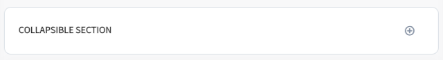
The \f055 and \f056 codes render the FontAwesome plus-circle and minus-circle icons, giving the toggle a clean expand/collapse visual cue. Make sure your Retool app has access to Font Awesome 5 Pro for this to render correctly.
Which Approach Should You Use?
If you're on a current version of Retool, use the native Collapsible Container component. It's faster to set up, easier to maintain, and officially supported. The manual approach is best reserved for situations where you need pixel-level control over styling, or you're working in an environment where the native component isn't available. Either way, collapsible sections are a powerful pattern for keeping your internal tools clean and focused — hiding complexity until the user actually needs it.
Ready to build?
We scope, design, and ship your Retool app — fast.