Guides
Retool Chart Components: All 15 Types Explained
Retool's new chart components are now generally available, and they're one of the most significant UI upgrades the platform has shipped in a while. Instead of manually writing Plotly JSON every time you need a bar chart or a funnel, you can now drop in a pre-built component, point it at your data source, and configure everything visually. This guide covers all 15 available chart types, how to set them up, and the known limitations you'll run into before they're patched.
What Are the New Retool Chart Components?
Previously, building charts in Retool meant working with the Plotly JSON Chart component and writing configuration JSON by hand — fine for advanced use cases, but tedious for anything standard. The new chart components replace that workflow for the majority of use cases with 15 preset types that support visual configuration directly in the Retool editor.
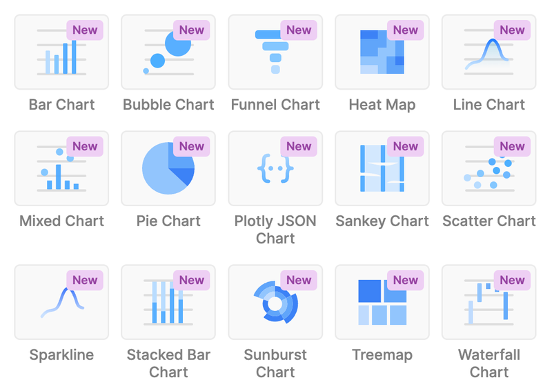
The full list of available Retool chart components is:
Bar ChartBubble ChartFunnel ChartHeat MapLine ChartMixed ChartPie ChartPlotly JSON Chart(for advanced use cases)Sankey ChartScatter ChartSparklineStacked Bar ChartSunburst ChartTreemapWaterfall Chart
All 15 are now generally available on Retool Cloud. If you're on Self-hosted Retool, they'll ship in the next edge release and the upcoming stable release — check your version before assuming they're available.
Key Features Across All Chart Components
Every new chart component shares a common feature set that makes them far more production-ready than the old approach:
- Multiple data sources per chart: Series-based charts (like
Line ChartandBar Chart) support multiple data sources, so you can overlay queries without pre-joining data. - Data grouping and aggregation: Group by a dimension and aggregate values (sum, count, average) without writing a SQL subquery just for display purposes.
- Configurable titles, legends, labels, and toolbars: All surface-level chart UI is configurable in the right panel — no JSON required.
- User interactivity controls: You can configure what happens when a user clicks a data point, enabling drill-downs and filter triggers directly from chart interactions.
- Escape hatch via
Plotly JSON Chart: When you need something the presets can't do — custom gauge charts, complex annotations, unified hover modes — thePlotly JSON Chartcomponent is still there and takes raw Plotly JSON configuration.
How to Set Up a Chart Component in Retool
Getting a chart running takes under two minutes if your query is already configured. Here's the straightforward path:
- Step 1: In your Retool app editor, open the component panel and search for the chart type you need (e.g.,
Line Chart). - Step 2: Drag the component onto your canvas.
- Step 3: In the right-hand config panel, set your Data source to the query returning your dataset. The query should return an array of objects.
- Step 4: Map your X-axis and Y-axis fields to the appropriate keys in your data (e.g.,
datefor X,revenuefor Y). - Step 5: Add additional series if needed — each series can point to a different query or a different column in the same dataset.
- Step 6: Use the Grouping and Aggregation options to roll up data at the display level rather than the query level.
- Step 7: Configure interactivity under the Event handlers section — for example, fire a query or set a state variable when a user clicks a bar.
Known Limitations to Be Aware Of Right Now
The components are GA but not fully featured yet. If you're building something complex, here's what you'll hit:
- No way to disable a series conditionally: If you have an optional series (e.g., a breakdown dimension that users may or may not select), there's currently no way to hide or disable that series programmatically. The workaround is to conditionally build your data array before passing it to the chart. A feature request is on the Retool roadmap.
- Hover tooltip customization is limited: Combining series on a single tooltip (the "x unified" hover mode from Plotly) isn't natively configurable yet in the preset components. If you need this behavior, use the
Plotly JSON Chartwith ahovermode: "x unified"layout config for now. - No gauge chart preset: If you need a gauge chart for financial dashboards or goal tracking, it's not in the preset list. The Retool team has acknowledged the request but won't be prioritizing it immediately. Use the
Plotly JSON Chartwith a gauge trace type as your workaround. clearSelectedPoints()not yet implemented: If you're migrating from the legacy chart component and relied on theclearSelectedPoints()method, note that it's missing from the newPlotly JSON Chart. This is a known gap — follow the community thread for updates.
When to Use the Plotly JSON Chart Instead
The Plotly JSON Chart component is the right choice when you need full Plotly API access — custom trace types (like gauge or candlestick), advanced layout control, hovertemplate customization, or annotations. Think of the preset components as covering the 80% case. The Plotly JSON Chart is your escape hatch for the rest. You can pass any valid Plotly figure object as JSON, including data, layout, and config keys.
Bottom Line
The new Retool chart components eliminate most of the friction around building charts in internal tools. For straightforward visualizations — bar charts, line charts, funnels, pie charts — you can now go from query to chart in minutes. For edge cases around tooltip behavior, conditional series, and the missing clearSelectedPoints() method, lean on the Plotly JSON Chart or keep an eye on Retool's release notes for incoming fixes. The foundation is solid; the rough edges are known and tracked.
Ready to build?
We scope, design, and ship your Retool app — fast.